A not-so imaginary conversation between a service personnel and a desperate customer.
Customer: Why can't I install this application to my laptop?
Service: Which OS are you using?
Customer: Vista.
Service: (Voiceless but audible sigh) Do you use the 32-bit version or 64-bit version?
Customer: What is that?
Service: There are two versions of Vista OS, 32-bit and 64-bit, according to their maximum memory sizes. If you have the 32-bit version, the maximum amount of memory is 4GB. If you have the 64-bit version, much more than that.
Customer: How the hell I know? Nobody told me anything about it.
Service: Well, could you please open the Control Panel and...
Customer: (Why did I put myself into this pitfall?) Okay, just a sec...
The more we try to clarify the situation, the more chaotic it becomes. We should all appreciate Microsoft for turning ourselves into philosophers.
Sep 30, 2009

Sep 27, 2009
Avoiding typeface errors
I would like to conduct a simple test. Pick a typeface that is appealing to me for some reason that I cannot articulate, examine its usability (legibility and readability) and its personality (if the typeface is a person, what would he or she be like?) to find out the reason why I was attracted to it in the first place. The typeface used by default here is Trebuchet.

I will also apply the same test to two other typefaces to which I have negative biases.


I will also apply the same test to two other typefaces to which I have negative biases.


Let's begin the test. I will paste a block of text in each typeface and see their readability, legibility, and personality.


Sep 26, 2009
Mini-anatomy of Taiwan Mcdonald website
Let's take a look at the local Mcdonald website: Taiwan.
http://www.mcdonalds.com.tw/
Here I find two trends that are commonly seen in Taiwanese websites: emphasizing visual appearance and pushing "About us" to the frontline. Asian trend, maybe.
They really pay attention to visual effects as seen in the 'floating' effects. Visually stunning, but not too user-friendly: each time we click something, we need to wait for several seconds for the Flash plugin to load the content. Although the overall design emphasizes family-friendliness by using circle as the primary motif, three of the seven 'stars' in the home page are dedicated to corporate affairs: About us, Quality assurance, and Social responsiveness. The website might appear 'round', but inside we find the content more 'square' than we might anticipate.
Overall, although the Taiwanese Mcdonald website does contain rich information about its menu and service, it still gives us an impression that it pays more attention to form than content.
Bold, Italic, and Underline
Probably these are how I use text variations.
Bold: Pay attention!
Italic: Look, I am different.
Underline: Click me. (imagine there is an underline ;-)
Bold: Pay attention!
Italic: Look, I am different.
Underline: Click me. (imagine there is an underline ;-)
Death of a fontman
What I recently started noticing is the slow death of serif fonts in our life as writers. Actually, "writing" now means "typing" using the keyboard. The major tools for typing nowadays are:
Word was once THE tool for creating documents, but as our writing tools shifts into web-based applications, I am seeing less Word-based documents. As I recall, I have only written once in Word in the last 5 days or so.
If this trend continues (and spills over to the reading world, which is already happening thanks to our leaving paper-based publications), will serif fonts turn into decorative fonts, like - er - comic sans?
- Web (forums like this, Twitter, Facebook, etc.)
- MS Office (Word, Excel, Powerpoint)
Word was once THE tool for creating documents, but as our writing tools shifts into web-based applications, I am seeing less Word-based documents. As I recall, I have only written once in Word in the last 5 days or so.
If this trend continues (and spills over to the reading world, which is already happening thanks to our leaving paper-based publications), will serif fonts turn into decorative fonts, like - er - comic sans?
Sep 24, 2009
Child-oriented or Adult-oriented: how to make the website age-centric
How do we design a website so that it appeals to a specific age group?
To approach this question, let's compare two websites which are very successfully designed, but use different design approach due to the age group of their target users.
Website designed for adults (+21): CEVA Inc.
CEVA is a licensor of silicon intellectual properties specializing in digital signal processor for mobile devices. CEVA's website is engineer-centric, loaded with product specifications and application examples as well as supplementary diagrams.

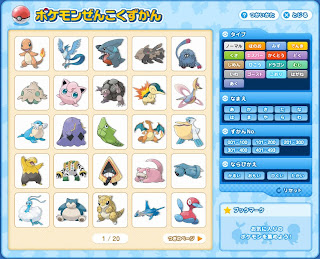
Website designed for kids (-15): Catalog of Pocket Monsters
Pocket Monsters a.k.a. Pokémon is a game series that has been running on Nintendo handheld devices. There are almost 500 types of “Monsters” which are listed in this online catalog (Japanese). The website, part of the official website, is targeted at young users with its simple structure and colorful design.
How the sites are analyzed
I will analyze the two sites in the following dimensions: user roles, user goals, knowledge base, physical abilities, circumstances of use, and culture. The focus is on the difference between adult (andragogy) and child (pedagogy) learning styles in each of the above dimensions. There is no anecdotal evidence about these dimensions for the target websites so I can rely on empirical data through my experience of working in the silicon intellectual property business and growing up in Japan.
User roles and goals
CEVA: staff engineers (obtain specifications), sales managers (check market applications), stakeholders (check invester information)
Most users of CEVA website has official roles in their workplaces. They are conscious about their roles and act according to their titles. The goal of CEVA users is to make decisions: whether to purchase the properties from engineering or management point of view, and whether to invest or not.
Pokémon: researchers (learn monster characteristics), collecters (store data)
Users of Pokémon website do not possess formal titles. They assume the above mentioned roles mostly without awareness of the roles they are playing. The goal of Pokémon users is to gain: know more or store more so that they can compete with their friends or increase their catalog of information.
Knowledge base
CEVA: B.S or M.S in engineering
Most users of CEVA website possess a degree in engineering or science-related fields. This is due to the highly sophisticated technology used in the product. Managers and stakeholders usually possess additional skills or degree for sales and investment. Also, they can operate computer applications fairly well and can navigate the website easily.
According to learning theory (andagogy), adults learn best when able to link new knowledge and skills to knowledge and skills learned previously, therefore the website links its contents to various articles and diagrams, making a huge ‘web’ that reaches out even for external sites. The image below shows the website’s sitemap, indicating the complexities of the website.

Pokémon: practical knowledge at playing Pokémon games
Users of Pokémon website most likely own a Pokémon video game or trading cards, so they possess knowledge and skill for playing the game. They do not necessarily possess computer skills.
Besides their limited navigational skill which is discussed later, child users in general prefer receiving an overview of the presented information, then individual examples. The image below shows the search result based on a keyword. We can clearly see the website does not change its structure and presents the overview.

Physical abilities (human factors)
CEVA: older adults with deep navigational skills and some sight problems
All users of CEVA website are adults. Therefore they have enough experience and knowledge to navigate complex information but sometimes need visual enlargements.
The CEVA website has multiple navigational levels, changing its structure according to the page content. Adult learners generally have no problem dealing with it. The image below shows that when viewing specific details, the layout changes drastically from the home page.

Pokémon: schoolkids with limited navigational skills
Users of Pokémon websites have limited experience, therefore prefer to navigate simple websites.
The Pokémon website has only one navigational level: the main screen. No matter what the user does, the screen structure and layout does not move, giving users a comfortable ‘playground’ feeling. This style suits childs with limited navigational capability. The image below shows that even after switching the content from overview to a specific monster, the site structure stays the same.

Circumstances of use
CEVA: during work
CEVA website is focused on providing useful information for making purchasing decisions, engineering-wise and sales-wise. Therefore, users access the website during office hours from their workplace.
Although some images of young ladies are added to attract male-dominated engineering world, the website is text-based, making it Safe-For-Work for any business circumstances. The image below shows how the image is safely accompanied by the text.

Pokémon: during private time
Schoolkids are generally not allowed to access websites at school, and they do not possess portable computers, therefore the website should be accessed mostly from their home. As a result, all screens become image-oriented rather than text-oriented because there is no restrictions as in the adult world, as shown in the screenshot below.

Culture
CEVA: large-sized corporates in the US, Europe, and Asia
Geographically users of CEVA site is widely spread among the world, and although most of them belong to the semiconductor industry, their culture is diversed. Therefore the learning should also be influenced more by the users’ similarities than differences. The image below shows an example of an article written in a standard manner accepted by major publications worldwide.

Pokémon: Japanese schoolkids
Although Pokémon is famous worldwide, the website is dedicated to the Japanese-speaking culture. Therefore the users likely share the same cultural backgrounds. The website uses Japanese language and the round-edged, warm-colored tone to emphasize cuteness as the cultural focus as shown in the image below.

To approach this question, let's compare two websites which are very successfully designed, but use different design approach due to the age group of their target users.
Website designed for adults (+21): CEVA Inc.
CEVA is a licensor of silicon intellectual properties specializing in digital signal processor for mobile devices. CEVA's website is engineer-centric, loaded with product specifications and application examples as well as supplementary diagrams.

Website designed for kids (-15): Catalog of Pocket Monsters
Pocket Monsters a.k.a. Pokémon is a game series that has been running on Nintendo handheld devices. There are almost 500 types of “Monsters” which are listed in this online catalog (Japanese). The website, part of the official website, is targeted at young users with its simple structure and colorful design.

How the sites are analyzed
I will analyze the two sites in the following dimensions: user roles, user goals, knowledge base, physical abilities, circumstances of use, and culture. The focus is on the difference between adult (andragogy) and child (pedagogy) learning styles in each of the above dimensions. There is no anecdotal evidence about these dimensions for the target websites so I can rely on empirical data through my experience of working in the silicon intellectual property business and growing up in Japan.
User roles and goals
CEVA: staff engineers (obtain specifications), sales managers (check market applications), stakeholders (check invester information)
Most users of CEVA website has official roles in their workplaces. They are conscious about their roles and act according to their titles. The goal of CEVA users is to make decisions: whether to purchase the properties from engineering or management point of view, and whether to invest or not.
Pokémon: researchers (learn monster characteristics), collecters (store data)
Users of Pokémon website do not possess formal titles. They assume the above mentioned roles mostly without awareness of the roles they are playing. The goal of Pokémon users is to gain: know more or store more so that they can compete with their friends or increase their catalog of information.
Knowledge base
CEVA: B.S or M.S in engineering
Most users of CEVA website possess a degree in engineering or science-related fields. This is due to the highly sophisticated technology used in the product. Managers and stakeholders usually possess additional skills or degree for sales and investment. Also, they can operate computer applications fairly well and can navigate the website easily.
According to learning theory (andagogy), adults learn best when able to link new knowledge and skills to knowledge and skills learned previously, therefore the website links its contents to various articles and diagrams, making a huge ‘web’ that reaches out even for external sites. The image below shows the website’s sitemap, indicating the complexities of the website.

Pokémon: practical knowledge at playing Pokémon games
Users of Pokémon website most likely own a Pokémon video game or trading cards, so they possess knowledge and skill for playing the game. They do not necessarily possess computer skills.
Besides their limited navigational skill which is discussed later, child users in general prefer receiving an overview of the presented information, then individual examples. The image below shows the search result based on a keyword. We can clearly see the website does not change its structure and presents the overview.

Physical abilities (human factors)
CEVA: older adults with deep navigational skills and some sight problems
All users of CEVA website are adults. Therefore they have enough experience and knowledge to navigate complex information but sometimes need visual enlargements.
The CEVA website has multiple navigational levels, changing its structure according to the page content. Adult learners generally have no problem dealing with it. The image below shows that when viewing specific details, the layout changes drastically from the home page.

Pokémon: schoolkids with limited navigational skills
Users of Pokémon websites have limited experience, therefore prefer to navigate simple websites.
The Pokémon website has only one navigational level: the main screen. No matter what the user does, the screen structure and layout does not move, giving users a comfortable ‘playground’ feeling. This style suits childs with limited navigational capability. The image below shows that even after switching the content from overview to a specific monster, the site structure stays the same.

Circumstances of use
CEVA: during work
CEVA website is focused on providing useful information for making purchasing decisions, engineering-wise and sales-wise. Therefore, users access the website during office hours from their workplace.
Although some images of young ladies are added to attract male-dominated engineering world, the website is text-based, making it Safe-For-Work for any business circumstances. The image below shows how the image is safely accompanied by the text.

Pokémon: during private time
Schoolkids are generally not allowed to access websites at school, and they do not possess portable computers, therefore the website should be accessed mostly from their home. As a result, all screens become image-oriented rather than text-oriented because there is no restrictions as in the adult world, as shown in the screenshot below.

Culture
CEVA: large-sized corporates in the US, Europe, and Asia
Geographically users of CEVA site is widely spread among the world, and although most of them belong to the semiconductor industry, their culture is diversed. Therefore the learning should also be influenced more by the users’ similarities than differences. The image below shows an example of an article written in a standard manner accepted by major publications worldwide.

Although Pokémon is famous worldwide, the website is dedicated to the Japanese-speaking culture. Therefore the users likely share the same cultural backgrounds. The website uses Japanese language and the round-edged, warm-colored tone to emphasize cuteness as the cultural focus as shown in the image below.

Sep 17, 2009
Elements of design in a video
Let's take a short video clip and examine what makes it so visually effective, or why does it make us watch it repeatedly. To be precise any piece of video that has Bill Murrary or zombie in it automatically keeps my attention but here we focus on its design aspects.
I will take a video clip from One of the playlists in Youtube which is dedicated to typography. Boring? No! (well, some yes) Shown below is the most intriguing piece of work using typography that I have ever seen.
What makes this video so visually effective? Aside of creative thinking, technical-wise it utilizes various shapes of letters in two opposite directions: the letters themselves, and the open space created by them. We might say they compensate each other, like in Yin and Yang. Here I will list example sequences from the video to highlight the usage of letter or lack thereof.
Using the open space
00:25 Trapped man
A "trapped man" figure is created by the open area between the letter C and E. The designer of the video creates a shape by closing the open space, thus reversing the relationship between background and foreground. The man-shape becomes more apparent when his eyeballs followed by his full body emerges in white color, making a stark contrast between the dark background. The large and small version of the figure creates both contrast and rhythm, even though basically they are the same.
00:38 The Fantastic Mr. Fox
Again, a clever usage of the trapped area is shown. This time, a face of a fox emerges by the area trapped between the letter M and V. The bright-red letters successfully separates the outside (background) and inside (Mr. Fox). Since the two letters are closely placed, we can easily close the gap between the letters and imagine the inner area as an isolated shape. Another type of closure occurs here - we only have the fox's eyes as his visual clue, but we naturally imagine the rest of his face (nosetip, whiskers, earbud, so on). This segment tells us the importance of the eyes for our recognition. Wiggling Mr. Fox's ears just by adjusting the letter "M" is a nice bonus. It is only a slight move, but works effectively because the other area stays still.
Using the letters themselves
00:44 Lettered ships
We see several vessels with their major parts constructed by various letters. This time, instead of using the open area, the letters themselves come into play. To create a figure, sometimes a single letter is scaled up ($ as the mast, T as the anchor), and sometimes small letters are placed repetitively (m for a window, i for oar). This section tells us that relying on the original aspect (shape and size) of the material (letter) is not the only solution - even for mundane shape like i or m has its unique usage.
01:18 Faces created by typefaces
We see a series of human faces and figures almost solely consist of typography. Some figures entirely consist of letters and their placement or scaling (such as in the bowing ladies figure with the letter k and l), and some uses supplementary figure to help viewers imagine what the shape is about (such as in the snorkeling man with additional fish and bubbles). This section not only uses ordinary letters but borrows strange-looking characters from non-English languages. Although they might be relying too much on the complexity of the letters rather than creative placement and scaling, they add dynamic movements and variety.
Other elements
Typography is not the only design element in this video. Two elements are worth noting: music and background. The music adds enough tension to make viewers feel "something is coming along" plus provides a classical, well-mannered taste. Its contrast between the playfulness of the video highlights the typography effect even more. The background mostly consists of combination of basic colors. It adds excitement to the sometimes bland texts (they are all black) and carries the animation forward.
---------------- Bonus material ------------------------
Introducing only the "best" does not do justice to such a rich assortment of creative videos. Here are some more that didn't make it to the top but nevertheless are worth mentioning.
Most stunning message
This video needs no explanation. It just has to be viewed. I would have chosen this video if its power lied in visual design (unfortunately no).
Text as the storyteller
An ordinary mini-story turns into a dramatic play thanks to typography. The presense of music also has a big part. Because the visual effect is rather limited, the music leaves larger impression, making the story even more dramatic. A good reminder of how important not to rely only on visual effects.
Have we seen this before? Maybe, in the 80s by the musician whose former name was the musician whose former name was Prince (recursive). Youtube does not contain Sign of the Times video anymore. Boo.
Most Playful
Can we go one step forward and migrate lyrics into video as characters, not just as subtitles? YouTube is filled with presentations with texts disguised as a (relatively) lawsuit-free music videos. The 'informing' part of their design communication works well, especially the texts contain serious messages that are hard to follow (like the case below).
But that is too static. Let them play dynamically, and here is the result. Isn't it nice to see the background color changes to blue when the song says "blue"?
Last bonus: Helvetica
This is a snippet from a full-length documentary called, er, Helvetica about the ubiquitous typeface. Overused yes, but Helvetica is still a beautifully designed font. The documentary tip-toes on the thin borderline between bordomness and edginess (for some people including myself, the same). Trivial Trivia: In Will & Grace, Jack declares his resume must be typed in Helvetica.
Sep 13, 2009
Think like a designer: applying design philosophy into our work (welcome to reality)
Presentation Zen is a fantastic collection of design-oriented stuff (not restricted to presentation) from Garr Reynolds.
Here we have 10 tips on how to think like a designer. Any one of them rings true, but which one speaks loudest to me?
(7) Think communication not decoration.
As a technical writer, I focus on simulating what users would like to know or likely stumble upon when using a product or service and present the solution in simple yet accurate manner. Think communication is something that I believe in and also something that I should have been focusing more. For me it says "Solve problems before they become problems." In other words, make sure the users can operate the product WITHOUT reading manuals at all.
In my real life, it means if a product requires 7 operational steps to activate it, instead of sweating my brain over using bullet / numbered points or squeezing them neatly into a single page, I would (should) go to the lead engineer and demand a big, red Power Button. Two pages are gone from my portfolio and salary, but also from users' heads, which is what matters. I will present a well-known example which embodies Think communication philosophy.
Like thousands of designers out there, technical writers also look up to Apple for inspiration and example (especially the managers love this approach - think/do/look like Apple is the new black for them). But do their manuals work as a golden sample for aspiring technical writers? Yes and No (It depends is a cop-out solution but also is true...). No because their manuals do not cover the entire aspects of their product and - they are not beautifully designed (dare I say it). Yes because these manuals do just enough of their job. Installation, configuration, technical specifications, they are there. There is one more: a big part of their manuals are embedded in the product itself.
What the sentence above means is that they refine the design of the product until it becomes intuitive enough so users do not need to read manuals, or they can learn on their own by using the product itself. I guess their lead technical writer spends more time feedbacking to product designers than writing warning notes and operation steps. As a result they have far less glorious manuals compared with their products, but they all work brilliantly.
Note:
The same intuitive design approach applies to Nintendo's gaming consoles (anybody who has used Wii or DS might agree) but they do come with thick manuals. Being a Japanese, I must say that it has something to do with Japanese culture and mentality but it is another story...
Sep 10, 2009
Anatomy of corporate blogging 2/2: PlayStation
PlayStation blog
This is the second of two analysis of corporate blogs. To view the other, please read the previous entry.
Some background
PlayStation is one of the most successful game console franchises. Although the latest generation, PlayStation 3, is lagging behind Nintendo and Microsoft in worldwide sales, the previous PlayStation 2 is still the best-selling game console in history with more than 140 million units sold.
What is this blog about?
This blog posts official announcements, release schedules, and special sales information regarding PlayStation hardware and software. It has three primary goals: to be the thought leader in the PlayStation ecosystem, collect as many feedbacks from PlayStation users, and give them a sense of ‘belonging.’
Design and layout
Below diagram shows the content structure, with notable features marked in red.

The structure is a standard two-column but it is almost over-crowded with various visual elements which are not uncommon in game-oriented blogs. Each entry consists of official announcements from Sony and is mostly half-page long. Surrounding the entries are various offerings and invitations from PlayStation store and network. Twitter, PlayStation fan network, downloads, and special sales information which allows this blog to work also as the online hub for users. Lengthy entries are purposefully avoided and commenting is actively encouraged. In fact, the commenting feature is greatly enhanced with reader ‘review’ system and unique icon (ID) for each user and author. More about this in the next paragraph.
What is special about this blog?
The user commenting feature of this blog is more powerful than most other blogs in the market. To summarize, users are treated with more respect. Each user is awarded with his own visual ID (icon) showing up in the screen. The comments to which the author of the post replies are marked in red, showing ‘worthy’ status. The authors are mid- to high-level managers of Sony Entertainment, so being replied works as a ‘badge of honor’ here. Finally, users can rate the original post with stars. This makes the communication between users and Sony stuff two-way, evaluating each other. In this blog, users are not treated like necessary evil - they are recognized as the vital part of the community.
Does it work?
In short, yes it is working very well. The first question that came to my mind when I started looking into PlayStation blog was, ‘Who needs another blog about gaming?’ There are already hundreads of online sources, and it looked like the game maker’s job was simply creating products, and all the rest belonged to the online community. After all, ‘insiders’ can reveal interesting secrets (which does not apply here) but usually offer less interesting readings compared to seasoned editors and writers. This blog shows a more complex reality. Each entry in the PlayStation blog attracts hundreds of comments compared with dozens in other blogs. Technorati ranks the PlayStation blog at 1,456th (as of Sep 9 2009), a remarkable feat. Users are welcoming bonding with the maker, therefore willfully listening to the official message (it can be argued they do not AGREE with official statements, but in this world of information overflow, what matters is that the voices are HEARD, first of all). Sony is collecting vital marketing information through feedbacks, and also gaining loyalty from its users. A win-win relationship is seen here.
Anatomy of corporate blogging 1/2: Hatena
Cinnamon - the mascot character of Hatena, Inc.
This is the first of two analysis of corporate blogs. To view the other, please read the next entry.
Some background
Hatena is a Japanese internet service company offering blog hosting, social bookmarking, groupware, etc. Hatena has a big presence in Japan especially with their social bookmarking service, Hatena Bookmark, boasting the biggest market share in Japan.
What is this blog about?
This blog is supposedly a diary by Hatena's mascot character, a Welsh Corgi dog named Cinnamon. The blog is built using Hatena's own blog hosting service. The target audience is very broad: it is not only about users of Hatena's service but also anybody who is interested in blogging (or dog). The goal of this blog is not explicitly stated, but supposedly there are two of them: one is to encourage users to start their own blog by being Hatena's showcase (therefore this blog is a perfect metaphor for eat-your-own-dogfood practice), and the other is to increase Hatena's profile among users - techie and non-techie alike.
Design and layout
Below diagram shows the content structure, with notable features marked in red.

It is a standard two-column blog with relatively few visual elements. Each entry consists of the photo of the day and a short message from the dog himself (written by his owner, a staff member of Hatena). Hand-drawn background picture of animals and warm coloring clearly indicate the blog is family-friendly. Users can comment on each entry and if he already has his own blog through Hatena, he can add a "favorite" mark (here it is a dog icon) to his favorite entries. The number of "favorite" marks instantly shows which entry is popular among Hatena communities. Each "favorite" mark can be clicked which leads to the blog of the person who added the mark.
What is special about this blog?
The most intriguing aspect of this blog is its non-corporate style. The main content (photo and message) only mention 'personal' issues about the dog and nothing about Hatena or its service. Same for the links: no newsfeed, event, or advertisement. A link to dog-lovers blog group is visible, but that is a common practice for pet-oriented blogs in general. This blog is about letting Cinnamon, the mascot dog, be "just there."
Does it work?
This blog meets its goal remarkably well: its design and structure are approachable by anybody and it shows how to utilize Hatena’s blogging service including its unique "favorite" marking system. Each entry consistently acquires a dozen or more "favorite" marks, therefore it is fair to say the blog has a good amount of followers. My guess is that the reason it works so well is because there is no smell of "corporate" inside this blog. It is in itself a simple yet well-maintained blog dedicated to a beloved dog.
Sep 5, 2009
What is this blog about?
This blog lists insights and skills about getting our ideas or a piece of information across easily: in other words, making others 'get' it. We call it technical communication: helping others understand something to achieve what they want.
Practically it is about writing documents, drawing signs, making notes, creating spreadsheet and powerpoint slides - all stuffs we do to make our clients/boss/spouse/neighbors/kids/government take an action, or understand something.
Many tools and info are already available online - software, tips, self-test, podcast, so on. What I try to offer in this blog is a point of view, coming from the experience and insight from an almost self-taught technical writer working in Taiwan's IT industry.
The entries will be biased, topics will have less consistency, information will not always be the latest, and the whole blog will present only a partial picture of the world of technical communication. But they will always be true, from the author's point of experience and view. (*)
------------------------------
Here is the background story of how I became a technical writer.
Ever had the feeling that your life wasn't working at all and you didn't even know What, How, or Why? Of course, life is not that unfair. Fortunately in my case the rest was pretty clear: Who, Where, and When. I, here, now (then). Messed up.
That helplessness, the feeling that I was drowning inside a gigantic washing machine (filled with underpants, what else?) with my hands tied at the back, was the beginning: I might not be able to change the world (**), but I might be able to figure out what the hell is going on.
So I started skill training for 'figuring things out' and became a Field Application Engineer because a big part of that work was about figuring out what was going on in the business scene:
* Whatever unrelated stuff will go into the brother blog, Free the random thoughts.
** Of couse now I know: wecan change the reality just by thinking according to quantum physics always have the choice to change ourselves and our behavior, which is about changing our world.
Practically it is about writing documents, drawing signs, making notes, creating spreadsheet and powerpoint slides - all stuffs we do to make our clients/boss/spouse/neighbors/kids/government take an action, or understand something.
Many tools and info are already available online - software, tips, self-test, podcast, so on. What I try to offer in this blog is a point of view, coming from the experience and insight from an almost self-taught technical writer working in Taiwan's IT industry.
The entries will be biased, topics will have less consistency, information will not always be the latest, and the whole blog will present only a partial picture of the world of technical communication. But they will always be true, from the author's point of experience and view. (*)
------------------------------
Here is the background story of how I became a technical writer.
Ever had the feeling that your life wasn't working at all and you didn't even know What, How, or Why? Of course, life is not that unfair. Fortunately in my case the rest was pretty clear: Who, Where, and When. I, here, now (then). Messed up.
That helplessness, the feeling that I was drowning inside a gigantic washing machine (filled with underpants, what else?) with my hands tied at the back, was the beginning: I might not be able to change the world (**), but I might be able to figure out what the hell is going on.
So I started skill training for 'figuring things out' and became a Field Application Engineer because a big part of that work was about figuring out what was going on in the business scene:
- Sorting out chaotic situations (The product is in development hell)
- Showing what the reality is (Delivery is 3 months away, coding finishes next month. No, it is the other way around)
- And follow through... (Bad news: the entire team should stay at the site until completion. Good news: the hotel is only 5 minutes away)
* Whatever unrelated stuff will go into the brother blog, Free the random thoughts.
** Of couse now I know: we
Subscribe to:
Comments (Atom)


